


Siberian School of Baroque Music
Siberian School of Baroque Music is an educational platform for young musicians who want to refine their performance skills, immerse themselves in the aesthetics of the Baroque era, and study historically-informed performance (HIP). This project is a part of Bureau of New Music.
Scope
Logo design
Digital illustration
Tools
Figma
Illustrator
Photoshop
Timeline
December 2025
Problem
When designing this spin-off project for the Bureau of New Music, the goal was to continue developing the existing visual aesthetic while bringing in new stylistic elements that would better reflect the subject of this project.
Solution
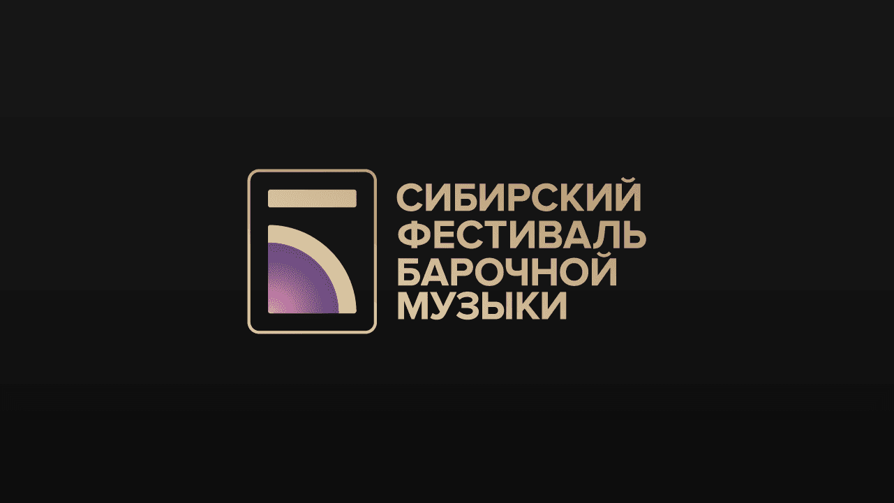
Two logos were created — one for the educational platform, and another for the Baroque festival where students of the school showcase their progress. Both logotypes build on the Bureau of New Music's original logo. To suit an early-music subject, the color palette has been updated to calmer tones with golden accents, and the shapes of the original logo mark have been slightly softened to match this mood.
The illustrations drawn for the initial marketing campaign were inspired by Baroque aesthetics in architecture and fashion, while still following the Bureau's original style.
Outcome
The visual identity contributed to the campaign's strong performance, giving the School a distinct yet familiar presence that helped it stand out among other classical music projects. This cohesive branding carried through to the festival, supporting a well-attended event and a clear, consistent presence across both platforms.
Siberian School of Baroque Music
Siberian School of Baroque Music is an educational platform for young musicians who want to refine their performance skills, immerse themselves in the aesthetics of the Baroque era, and study historically-informed performance (HIP). This project is a part of Bureau of New Music.
Scope
Logo design
Digital illustration
Tools
Figma
Illustrator
Photoshop
Timeline
December 2025
Problem
When designing this spin-off project for the Bureau of New Music, the goal was to continue developing the existing visual aesthetic while bringing in new stylistic elements that would better reflect the subject of this project.
Solution
Two logos were created — one for the educational platform, and another for the Baroque festival where students of the school showcase their progress. Both logotypes build on the Bureau of New Music's original logo. To suit an early-music subject, the color palette has been updated to calmer tones with golden accents, and the shapes of the original logo mark have been slightly softened to match this mood.
The illustrations drawn for the initial marketing campaign were inspired by Baroque aesthetics in architecture and fashion, while still following the Bureau's original style.
Outcome
The visual identity contributed to the campaign's strong performance, giving the School a distinct yet familiar presence that helped it stand out among other classical music projects. This cohesive branding carried through to the festival, supporting a well-attended event and a clear, consistent presence across both platforms.
Siberian School of Baroque Music
Siberian School of Baroque Music is an educational platform for young musicians who want to refine their performance skills, immerse themselves in the aesthetics of the Baroque era, and study historically-informed performance (HIP). This project is a part of Bureau of New Music.
Scope
Logo design
Digital illustration
Tools
Figma
Illustrator
Photoshop
Timeline
Logo design, brand identity, and initial set of digital illustrations — December 2023 to January 2024
Expanded set of illustrations and website for the School of Baroque and Contemporary Music — summer of 2024
Problem
When designing this spin-off project for the Bureau of New Music, the goal was to continue developing the existing visual aesthetic while bringing in new stylistic elements that would better reflect the subject of this project.
Solution
Two logos were created — one for the educational platform, and another for the Baroque festival where students of the school showcase their progress. Both logotypes build on the Bureau of New Music's original logo. To suit an early-music subject, the color palette has been updated to calmer tones with golden accents, and the shapes of the original logo mark have been slightly softened to match this mood.
The illustrations drawn for the initial marketing campaign were inspired by Baroque aesthetics in architecture and fashion, while still following the Bureau's original style.
Outcome
The visual identity contributed to the campaign's strong performance, giving the School a distinct yet familiar presence that helped it stand out among other classical music projects. This cohesive branding carried through to the festival, supporting a well-attended event and a clear, consistent presence across both platforms.




© 2026 Yasha Lyashuk
I'm available for contract opportunities, as well as full-time and part-time roles.
© 2026 Yasha Lyashuk
I'm available for contract opportunities, as well as full-time and part-time roles.
© 2026 Yasha Lyashuk
I'm available for contract opportunities, as well as full-time and part-time roles.