


Music Unites Festival (2024)
Music Unites is a festival of academic music that gives amateur musicians the opportunity to perform on the same stage with professional musicians in ensemble and orchestral programs.
Scope
Logo design
Visual identity
Web design
Print design
Merchandise
Tools
Figma
Photoshop
Illustrator
InDesign
CorelDRAW
Tilda
Timeline
October 2023 to June 2024
Problem
The existing style of Music Unites reflected its origins as a student-driven, youth-oriented initiative: treble-clef logo, abstracted geometric shapes evoking musical instruments, and a bright, high-contrast color scheme. While initially achieving its goals, this style was struggling to catch up with the expanding ambition of the project. By 2024, the festival had grown enough to target a more mature and sophisticated audience, expand its focus to new art forms, produce its biggest event lineup yet, and secure critical support from major cultural institutions. The original visual identity no longer matched that scale.
Solution
The goal behind the redesign was to build a recognizable and adaptable visual system that embodies the festival's values and highlights its matured identity. For the logo, I designed an abstract symbol that evokes the glissando—the notation marking a continuous slide between pitches. This way, the logotype not only nods to musical notation (without falling back to obvious and overused symbols such as a treble clef or a musical note) but also represents the sense of community that’s driving the festival.
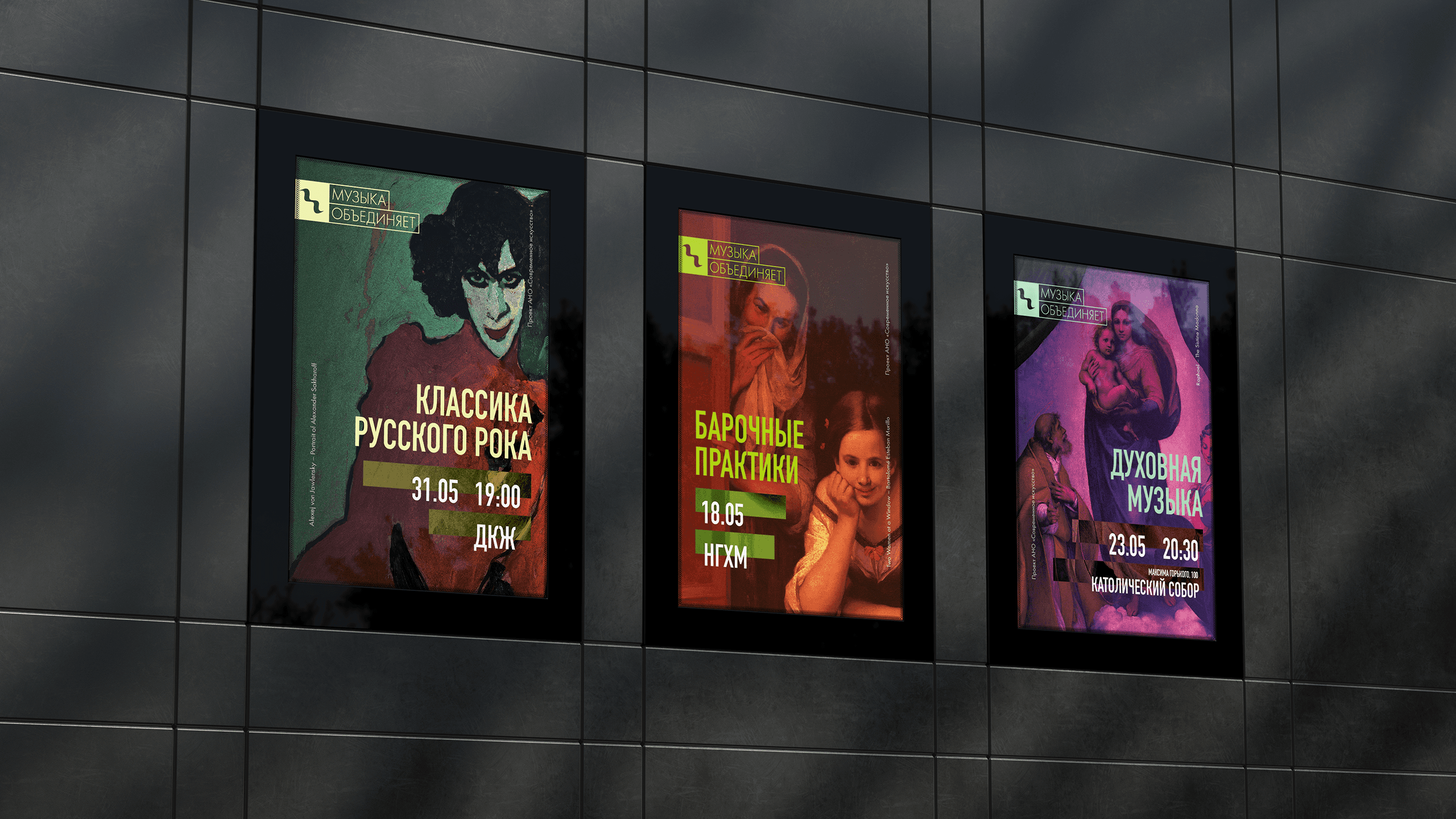
The core visual material of the festival's updated identity is a set of classical paintings infused with bright, almost neon colors and bold typography. This attempt to place classical artworks in a variety of digital and physical mediums not only creates a unified and unique visual system but also emphasizes the festival's expanding focus from music to a broader selection of art forms.
Outcome
This redesign helped reintroduce Music Unites in spring of 2024. The new visual system has shown great adaptability, as marketing materials for 15 major events were created — including social media posts, digital advertising, and print promotional products ranging from A5 flyers to 10 sq. m. banners. A lineup of merchandise was also introduced, giving the festival and its new branding a presence outside event locations.
Music Unites Festival (2024)
Music Unites is a festival of academic music that gives amateur musicians the opportunity to perform on the same stage with professional musicians in ensemble and orchestral programs.
Scope
Logo design
Visual identity
Web design
Print design
Merchandise
Tools
Figma
Photoshop
Illustrator
InDesign
CorelDRAW
Tilda
Timeline
October 2023 to June 2024
Problem
The existing style of Music Unites reflected its origins as a student-driven, youth-oriented initiative: treble-clef logo, abstracted geometric shapes evoking musical instruments, and a bright, high-contrast color scheme. While initially achieving its goals, this style was struggling to catch up with the expanding ambition of the project. By 2024, the festival had grown enough to target a more mature and sophisticated audience, expand its focus to new art forms, produce its biggest event lineup yet, and secure critical support from major cultural institutions. The original visual identity no longer matched that scale.
Solution
The goal behind the redesign was to build a recognizable and adaptable visual system that embodies the festival's values and highlights its matured identity. For the logo, I designed an abstract symbol that evokes the glissando—the notation marking a continuous slide between pitches. This way, the logotype not only nods to musical notation (without falling back to obvious and overused symbols such as a treble clef or a musical note) but also represents the sense of community that’s driving the festival.
The core visual material of the festival's updated identity is a set of classical paintings infused with bright, almost neon colors and bold typography. This attempt to place classical artworks in a variety of digital and physical mediums not only creates a unified and unique visual system but also emphasizes the festival's expanding focus from music to a broader selection of art forms.
Outcome
This redesign helped reintroduce Music Unites in spring of 2024. The new visual system has shown great adaptability, as marketing materials for 15 major events were created — including social media posts, digital advertising, and print promotional products ranging from A5 flyers to 10 sq. m. banners. A lineup of merchandise was also introduced, giving the festival and its new branding a presence outside event locations.
Music Unites Festival (2024)
Music Unites is a festival of academic music that gives amateur musicians the opportunity to perform on the same stage with professional musicians in ensemble and orchestral programs.
Scope
Logo design
Visual identity
Web design
Print design
Merchandise
Tools
Figma
Photoshop
Illustrator
InDesign
CorelDRAW
Tilda
Timeline
October 2023 to June 2024
Problem
The existing style of Music Unites reflected its origins as a student-driven, youth-oriented initiative: treble-clef logo, abstracted geometric shapes evoking musical instruments, and a bright, high-contrast color scheme. While initially achieving its goals, this style was struggling to catch up with the expanding ambition of the project. By 2024, the festival had grown enough to target a more mature and sophisticated audience, expand its focus to new art forms, produce its biggest event lineup yet, and secure critical support from major cultural institutions. The original visual identity no longer matched that scale.
Solution
The goal behind the redesign was to build a recognizable and adaptable visual system that embodies the festival's values and highlights its matured identity. For the logo, I designed an abstract symbol that evokes the glissando—the notation marking a continuous slide between pitches. This way, the logotype not only nods to musical notation (without falling back to obvious and overused symbols such as a treble clef or a musical note) but also represents the sense of community that’s driving the festival.
The core visual material of the festival's updated identity is a set of classical paintings infused with bright, almost neon colors and bold typography. This attempt to place classical artworks in a variety of digital and physical mediums not only creates a unified and unique visual system but also emphasizes the festival's expanding focus from music to a broader selection of art forms.
Outcome
This redesign helped reintroduce Music Unites in spring of 2024. The new visual system has shown great adaptability, as marketing materials for 15 major events were created — including social media posts, digital advertising, and print promotional products ranging from A5 flyers to 10 sq. m. banners. A lineup of merchandise was also introduced, giving the festival and its new branding a presence outside event locations.



© 2026 Yasha Lyashuk
I'm available for contract opportunities, as well as full-time and part-time roles.
© 2026 Yasha Lyashuk
I'm available for contract opportunities, as well as full-time and part-time roles.
© 2026 Yasha Lyashuk
I'm available for contract opportunities, as well as full-time and part-time roles.