


Center for Theater Arts
Center for Theater Arts was an initiative to create an interdisciplinary cluster for independent creative teams. The idea behind the project was to transform a former theater building into a place where creatives could cooperate, develop, and launch their own art projects — free from the constraints of major cultural institutions.
Scope
Logo design
Tools
Illustrator
After Effects
Timeline
July 2024
Problem
As the project catered to a young and progressive audience, we needed to target a style that was distinct from the traditional, institutional feel of cultural establishments. The focal point of the launch was the idea of the Center as a place where any form of experimentation and creative expression would fit in. At the same time, the identity had to be developed within a tight timeframe — it needed to be flexible enough to scale and adapt after the rollout of its first iteration.
Solution
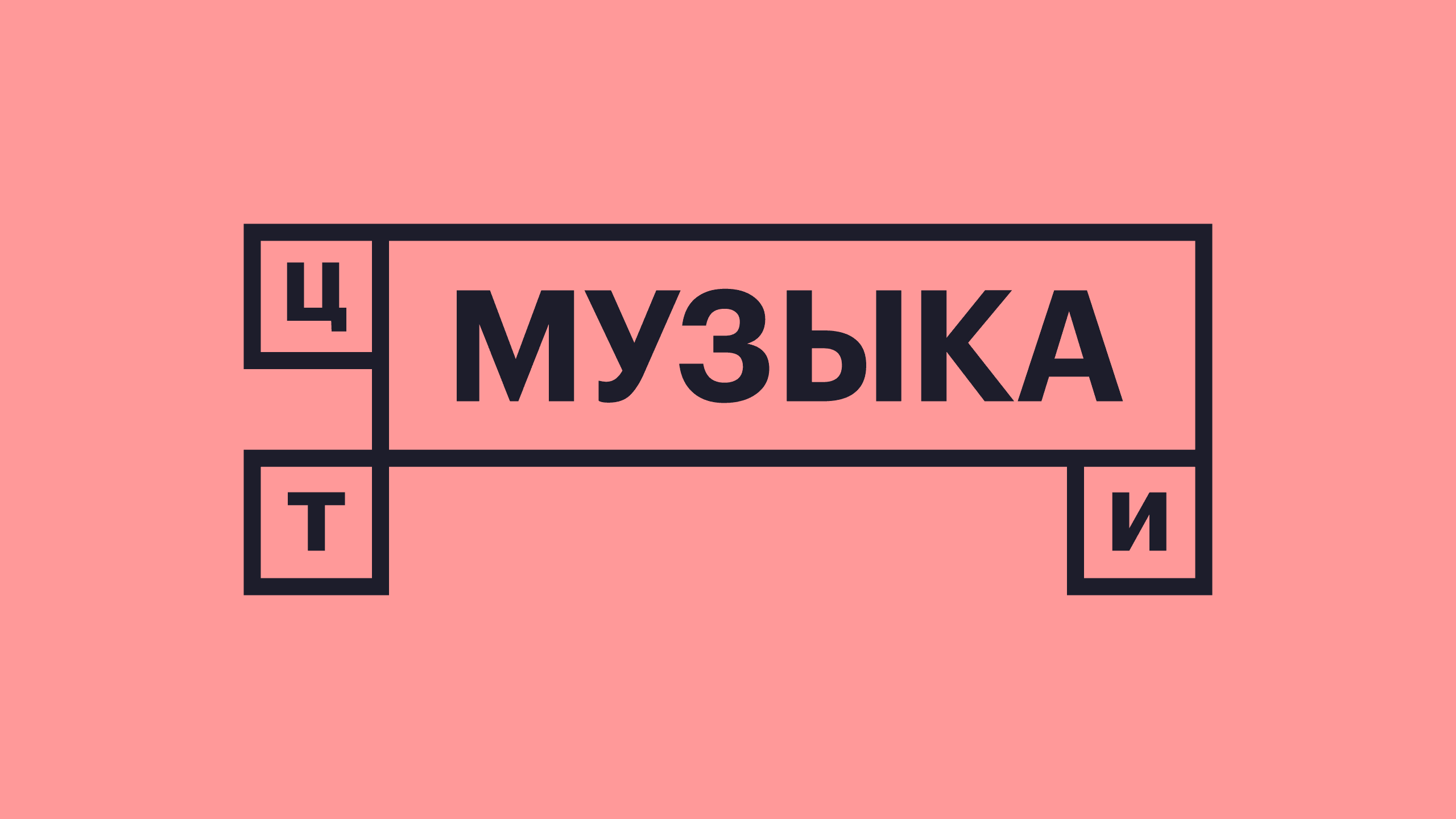
The key idea the marketing team developed was the Center as a blank slate, a space left open to be defined by whatever creative work moved into it. A modular grid built around the abbreviation (ЦТИ) became the core concept of the logo, with each letter placed in its own fixed cell alongside one larger, empty square. With this structure, the large, blank cell could hold different words — theater, music, gallery, and others. The frame with the abbreviation stood for the institution itself — constant and stable — while the changing content inside the open square represented creatives filling that platform with their own ideas. At the same time, the geometric construction of the logo and the bold, crisp typography represented the Center as the system that brought structure to diverse creative initiatives.
Outcome
Due to circumstances beyond the team's control, the project was cancelled before its official launch, so the only part of the design work that's been done are these little drafts for a logo.
Center for Theater Arts
Center for Theater Arts was an initiative to create an interdisciplinary cluster for independent creative teams. The idea behind the project was to transform a former theater building into a place where creatives could cooperate, develop, and launch their own art projects — free from the constraints of major cultural institutions.
Scope
Logo design
Tools
Illustrator
After Effects
Timeline
July 2024
Problem
As the project catered to a young and progressive audience, we needed to target a style that was distinct from the traditional, institutional feel of cultural establishments. The focal point of the launch was the idea of the Center as a place where any form of experimentation and creative expression would fit in. At the same time, the identity had to be developed within a tight timeframe — it needed to be flexible enough to scale and adapt after the rollout of its first iteration.
Solution
The key idea the marketing team developed was the Center as a blank slate, a space left open to be defined by whatever creative work moved into it. A modular grid built around the abbreviation (ЦТИ) became the core concept of the logo, with each letter placed in its own fixed cell alongside one larger, empty square. With this structure, the large, blank cell could hold different words — theater, music, gallery, and others. The frame with the abbreviation stood for the institution itself — constant and stable — while the changing content inside the open square represented creatives filling that platform with their own ideas. At the same time, the geometric construction of the logo and the bold, crisp typography represented the Center as the system that brought structure to diverse creative initiatives.
Outcome
Due to circumstances beyond the team's control, the project was cancelled before its official launch, so the only part of the design work that's been done are these little drafts for a logo.
Center for Theater Arts
Center for Theater Arts was an initiative to create an interdisciplinary cluster for independent creative teams. The idea behind the project was to transform a former theater building into a place where creatives could cooperate, develop, and launch their own art projects — free from the constraints of major cultural institutions.
Scope
Logo design
Tools
Illustrator
After Effects
Timeline
Logo design, brand identity, and initial set of digital illustrations — December 2023 to January 2024
Expanded set of illustrations and website for the School of Baroque and Contemporary Music — summer of 2024
Problem
As the project catered to a young and progressive audience, we needed to target a style that was distinct from the traditional, institutional feel of cultural establishments. The focal point of the launch was the idea of the Center as a place where any form of experimentation and creative expression would fit in. At the same time, the identity had to be developed within a tight timeframe — it needed to be flexible enough to scale and adapt after the rollout of its first iteration.
Solution
The key idea the marketing team developed was the Center as a blank slate, a space left open to be defined by whatever creative work moved into it. A modular grid built around the abbreviation (ЦТИ) became the core concept of the logo, with each letter placed in its own fixed cell alongside one larger, empty square. With this structure, the large, blank cell could hold different words — theater, music, gallery, and others. The frame with the abbreviation stood for the institution itself — constant and stable — while the changing content inside the open square represented creatives filling that platform with their own ideas. At the same time, the geometric construction of the logo and the bold, crisp typography represented the Center as the system that brought structure to diverse creative initiatives.
Outcome
Due to circumstances beyond the team's control, the project was cancelled before its official launch, so the only part of the design work that's been done are these little drafts for a logo.


© 2026 Yasha Lyashuk
I'm available for contract opportunities, as well as full-time and part-time roles.
© 2026 Yasha Lyashuk
I'm available for contract opportunities, as well as full-time and part-time roles.
© 2026 Yasha Lyashuk
I'm available for contract opportunities, as well as full-time and part-time roles.